Your website is your brand’s first impression, and sometimes, its biggest deal-breaker. Within seconds, visitors decide whether to stay or bounce. If your site feels confusing, outdated, or slow, they won’t think twice about leaving. Many of these bad web design practices stem from a few common website design mistakes —the kind that quietly scare visitors away (and hurt your bottom line).
Let’s uncover the most common website design mistakes and how to fix them before they haunt your business.
1. Slow load times
Nothing sends visitors running faster than a slow website. More than half of users (53%) leave a page if it takes longer than three seconds to load. Load speed also affects your SEO, conversions, and overall credibility.
Fix it fast:
- Compress and optimize images
- Minimize plugins and code
- Enable browser caching
- Use a content delivery network (CDN)
- Reduce redirects
2. Not mobile-friendly
More than 60% of global web traffic comes from mobile devices, yet many websites still aren’t optimized for mobile. Poor layouts, tiny buttons, and broken visuals frustrate users and damage your search visibility.
Fix it fast:
- Use responsive design
- Simplify navigation
- Design tappable buttons and forms
- Avoid disruptive pop-ups
- Prioritize essential content and speed
3. Cluttered layouts
A chaotic layout feels like walking into a noisy, overcrowded room; visitors don’t know where to look or what to do. Too many fonts, colors, or competing calls to action create confusion instead of clarity.
Fix it fast:
- Use white space generously
- Limit your color palette and font styles
- Streamline content and navigation
- Provide a clear visual hierarchy
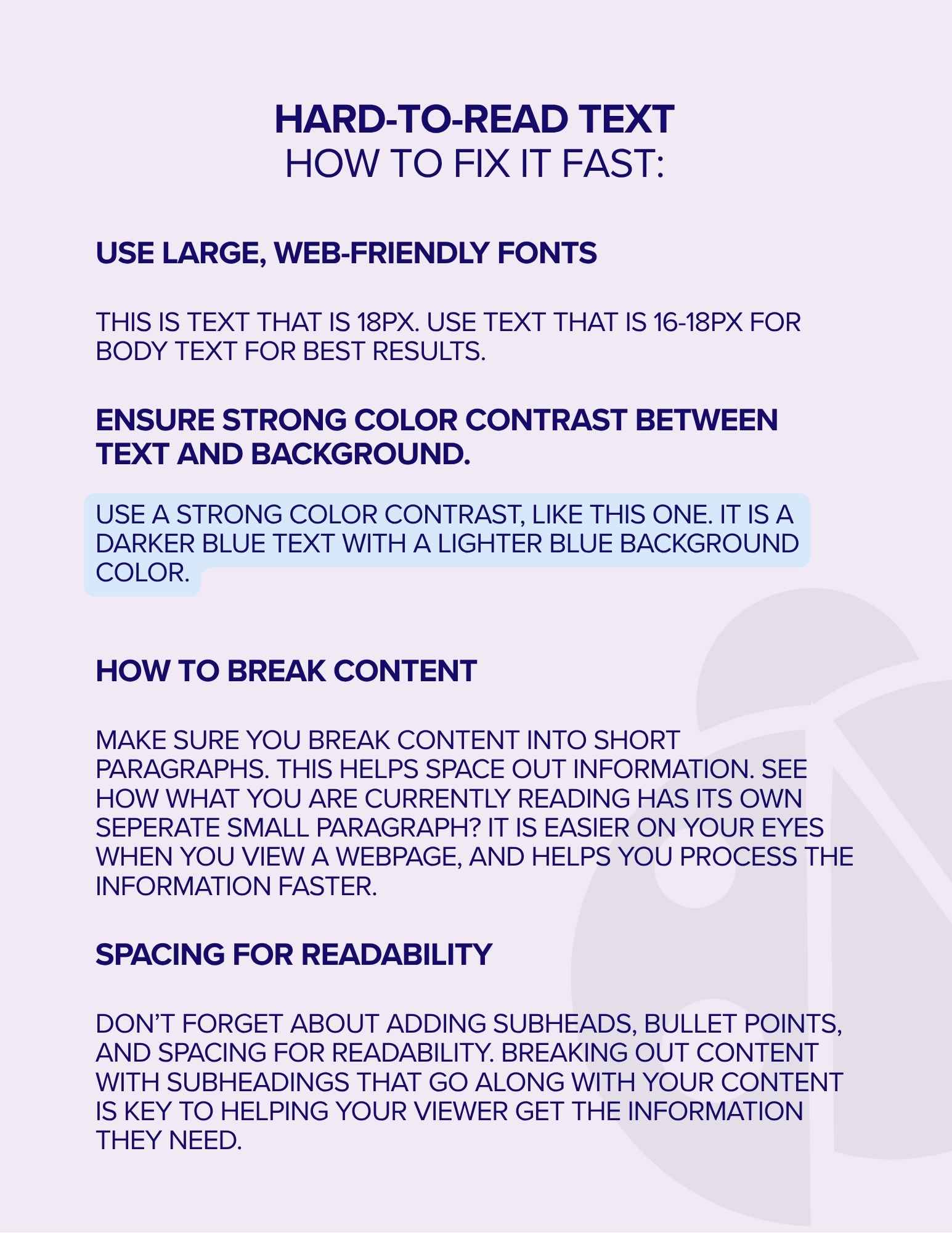
4. Hard-to-read text
Unreadable text is one of the fastest ways to lose visitors. Dense paragraphs, tiny fonts, and low contrast make your content impossible to scan, which increases bounce rates and hurts SEO.
Fix it fast:
- Use large, web-friendly fonts (16–18px for body text)
- Ensure strong color contrast between text and background
- Break content into short paragraphs
- Add subheads, bullets, and spacing for readability
5. Confusing navigation
If visitors can’t find what they’re looking for, they’ll leave. Complicated menus, hidden pages, and poor hierarchy turn browsing into a guessing game.
Fix it fast:
- Keep navigation simple and consistent
- Use clear labels like “About,” “Services,” and “Contact”’
- Prioritize key pages
- Highlight calls to action visually
- Simplify dropdowns and reduce clicks
5. Outdated tech and errors
Broken links, outdated design, and technical glitches send the wrong message — that your business is obsolete, too. Website maintenance isn’t optional; it’s part of protecting your brand.
Fix it fast:
- Regularly test links and forms
- ‘Update visuals, typography, and layout
- Replace outdated content
- Ensure responsiveness across all devices
- Modernize plugins, CMS, and code
7. Ignoring accessibility
More than one in four U.S. adults live with a disability, yet many websites still aren’t designed with accessibility in mind. Ignoring accessibility excludes potential users and can expose your brand to legal risk. To quickly check whether you have accessibility issues, you can run a test on Google to get a general score.
Fix it fast:
- Follow WCAG and ADA standards
- Add alt text to images
- Use strong color contrast
- Include captions and transcripts for videos
- Design for keyboard and screen-reader compatibility
8. Keyword-stuffed content
Overloading your site with repetitive keywords doesn’t improve SEO; it drives visitors away.
Today’s users (and search engines) prefer authentic, focused content that solves problems, not filler that sounds robotic.
Save the long-form stuff for your blog and guides to help your users understand your business and topics. Helpful long-form content can come in the form of checklists and downloads, and can improve SEO for your blog when people are looking for that exact type of content.
Fix it Fast
- Write for humans, not algorithms
- Keep service pages concise (under 1,500–2,000 words)
- Use blogs for in-depth or long-form content
- Focus on clarity and relevance
- Monitor engagement to refine messaging
9. Weak calls to action (CTAs)
Even beautifully designed websites fail if they don’t guide users toward the next step. One website design mistake many businesses make is forgetting to include CTAs altogether, or they bury them under too much content. Weak, generic buttons like “Submit” or “Learn More” don’t inspire clicks.
Fix it fast:
- Use clear, action-oriented CTAs (“Book a consultation,” “Get a quote,” “Join now”)
- Place CTAs consistently throughout your site — not just at the bottom
- Make buttons visually distinct with contrast and whitespace
- Test variations (color, size, placement) to improve conversion rates
10. Poor use of visuals
Low-quality stock photos or oversized hero images can destroy credibility and slow your site down. Your visuals should support your brand story, not just fill space.
Fix it fast:
- Use original, authentic images whenever possible
- Optimize image file sizes for speed
- Maintain consistent style, tone, and color
- Use visuals to communicate value or emotion, not decoration
11. Ignoring analytics and user data
A website is never “done.” Many businesses make the mistake of launching and walking away without tracking performance. Without analytics, you can’t see what’s working or where visitors drop off.
Fix it fast:
- Set up Google Analytics 4 and Google Search Console
- Track key metrics like bounce rate, conversions, and page performance
- Run regular A/B tests on headlines and CTAs
- Adjust content and design based on real user behavior
12. No clear brand identity
Even technically solid websites can fall flat if they don’t convey a recognizable, consistent brand. Inconsistent colors, messaging, or tone confuse visitors and dilute trust.
Fix it fast:
- Define a clear visual identity (logo, color palette, fonts, and imagery)
- Use consistent brand voice and tone across all pages
- Align messaging with your audience’s values and goals
- Reinforce your brand story through headlines and visuals
Quick website design mistakes quick fix checklist
Before you publish, run through this checklist to make sure your website is doing its job — not driving visitors away:
- Optimize site speed
- Design mobile-first
- Simplify cluttered layouts
- Use straightforward, readable typography
- Streamline navigation
- Keep technology updated
- Ensure accessibility
- Avoid keyword stuffing
- Strengthen calls to action
- Use authentic, optimized visuals
- Track and analyze user data
- Maintain consistent branding
Ready to turn your website from scary to spectacular?
Your website shouldn’t send visitors running. By addressing these common design mistakes, you’ll create a faster, more intuitive, and more engaging experience that keeps users coming back.
If you’re ready to transform your underperforming site into a high-converting digital experience, partner with Ladybugz Interactive, Boston’s award-winning, women-owned digital agency. Let’s design something that delights – not frights.