Bad web design practices in 2025 abound, just as they always have. Luckily, you or your developer can identify and fix them to improve SEO, traffic, conversions, and your company’s reputation. Some problems are relatively minor and fairly easy to fix on a content management system like WordPress. Others require more complex solutions best left to professional web developers.
There are So Many Bad Web Design Practices to Avoid!
There are seemingly endless bad web design practices–and nearly endless good ones. Whether you plan to create a new site or update an existing one, reviewing these tips can help you create a website that performs well, enhances user experience, and gets results. Realize that it can’t all be done with the snap of a finger. However, if you put in the right amount of time and resources, you can take your website to the next stage in 2025. Partnering with an experienced WordPress design agency can help you achieve that transformation faster and more strategically.
Here are 15 Bad Web Design Practices You Can Identify and Fix in 2025.
1. Slow Page Load Speed
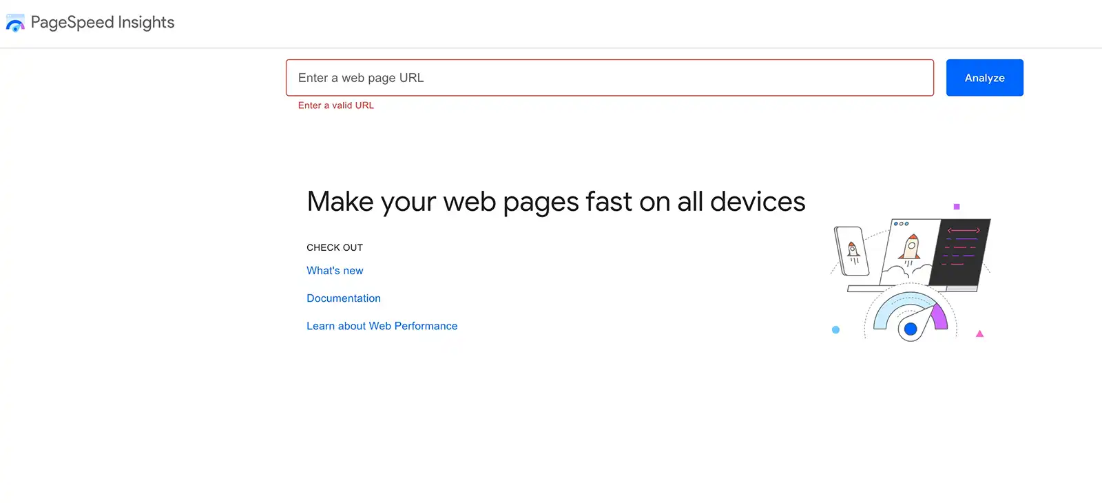
Slow page load speed negatively impacts user experience and is now a direct ranking factor for Google’s Core Web Vitals. In 2025, a bad website practice is loading time above two seconds.
How can I improve page load speed?
- Optimize and compress images.
- Remove irrelevant, useless code and minify CSS, JavaScript, and HTML code.
- Limit HTTP requests for images, fonts, scripts, and other page elements.
- Reduce page redirects.
- Enable browser caching to preload content for return users.
- Consider using a CDN (Content Delivery Network) to host and deliver your site’s static content from multiple server locations.
- Disable or delete outdated or inactive plugins.
- Choose a high-quality hosting solution.
2. Too Many Keywords in Subheads and Copy
Is using keywords a bad web design practice or useless in 2025? Most experts say that keywords are still valuable when used appropriately and in moderation. No one wants to read stilted copy designed primarily for search engines, and Google penalizes keyword stuffing.
How can I improve my headlines and copy for SEO?
- Concentrate on high-quality content, leaving SEO optimization for last.
- Make headlines relevant and appropriately lead into the copy underneath it.
- Increase the use of backlinking as an SEO strategy.
- Add more blogs, case studies, and other content that lead to high-value pages.
3. Extreme Use of Animations and Movement
At some point, many web developers went overboard with animations, leading users to be overwhelmed. In 2025, it’s time to avoid useless animations that can make a site clunky and slow and in general use bad web design practices.
How do I avoid bad web design practices such as animation overkill?
- Use sparingly and create more subtle animations and movements to enhance user experience, such as to explain complex scientific processes.
- Focus on usability to keep visitors on the page and provide a positive user experience.
- Explore page design, photos, videos, infographics, data-driven graphs, screenshots, and design-enhanced CTAs as animation alternatives.
4. No Physical Location Listed on Your Website
Without a physical location on your site, you lose out on appearing in local search results. You may also risk skirting regulations depending on your type of business. A physical location demonstrates legitimacy and even a selling point, such as a tech business in Boston’s Route 128 technology hub.
Where should I place the location, and what is the right information?
- Include a physical address (not a P.O. Box) and phone number on the footer of each page, even if it has to be your home address, virtual office, or co-work space.
- List your location on other assets, such as your social media and YouTube channels.
- Consider creating a location webpage, which will benefit SEO, provide helpful information (such as directions, a map, and hours of operation), and provide real estate for marketing elements.
5. Too Much Stock Photography Can Lead to Bad Web Design
While stock photos are cost-effective, they often look impersonal, lack authenticity, and fail to reflect your unique brand. Each company must weigh the pros and cons of using stock photos.
What are my options for reducing how many stock photos I use?
- Solicit user-generated content as appropriate for your business and industry.
- Use high-quality, correctly formatted photos taken by staff on digital cameras or smartphones.
- Sift through Creative Commons images, which only require citing and crediting the photographer, and free image libraries, like Pixabay or Pexels.
6. Too Many Different Typefaces and Fonts Being Used on Your Website
A typeface is an overall family style, such as Helvetica or Calibri. Fonts are typeface variations, such as bold and italic. Using too many typefaces and fonts looks confusing, messy, and unprofessional.
How many fonts should I use, and where should I use them?
- Limit webpages to three or four typefaces that complement each other.
- Use typefaces and fonts to differentiate headlines, subheads, and main text.
- Choose a typeface that works well in various sizes, ensuring the smallest size is mobile-friendly.
7. Too Many Images and Not Enough Copy on Your Website Design
Using high-quality content is never a bad website practice. While images add interest and vitality, too many can slow down your website–which can be even more critical to user experience and SEO.
What is the right balance of images to copy?
- Consider how to best tell your story, such as needing more text for a complex topic or using images to raise the emotional content.
- Use images to support, illustrate, emphasize, and complement your content.
- Remove irrelevant or distracting images.
- Test page speed, and consider removing images that slow down your page load times, especially for mobile viewing.
Site Speed Getting You Down?An Easy Guide to Improve your Website Speed (Without a Developer)
8. Poor Font Contrast And Accessibility
The inability to read website text leads to bad web design user experience, usability, and accessibility. The culprit is often low contrast between the font and the background color, images, or other graphic element.
How can I ensure sufficient contrast on my website?
- Follow the W3C (World Wide Web Consortium) Web Content Accessibility Guidelines (WCAG), which define appropriate color contrast guidelines for accessibility.
- Use one of the many free color contrast checkers to see if your colors meet WCAG guidelines.
- Update, replace, or remove background images containing text if you identify contrast issues.
- Enlarge type, especially for headlines, which may resolve contrast issues.
- Look at all text elements, including such as links and mouse-over colors.
9. Too Much Dense Copy and Not Enough Subheads
Too much copy or dense copy can overwhelm readers or prevent them from finding the information they want. At the same time, you need enough copy to persuade, educate, and motivate. It’s important to organize copy effectively and make smart use of headlines.
How much copy is enough, and how can I use headlines effectively?
- Break up copy with subheadings to organize the page, enhance flow, help users find what they’re looking for, and improve readability and scannability.
- Be consistent with spacing, color, and other characteristics in headlines and copy.
- Use the succinct H2 and H3 subheads to help structure the copy and create a logical flow.
- Write one to three short paragraphs under each headline, ensuring the copy is highly relevant for proper indexing.
- Base the copy length on how much information will lead the user to take the desired action.
Launching a startup biotech website: A complete guide from Seed to Series A
10. Poor Use of Color and Colored Fonts
Poor use of color and colored fonts is considered a bad web design practice for many reasons, including just bad web design practice in general and accessibility factors. Choosing a color pallet that represents your company and will appeal to your readers is critical. The best practice is to use three colors: 60% as light, neutral background color, 30% as a darker contrasting color, and 10% for accents. This ratio is ideal for differentiating sections of the page, providing visual interest, and enhancing readability without confusing the user.
How do I choose an appropriate color palette and use each color appropriately?
- Use the fundamentals of color theory to understand the relationships between colors.
- Select colors that reinforce your brand, company image, or website theme.
- Consider if you want to follow established industry color schemes or stand out with a distinct palette.
- Provide colors that improve accessibility for those with color blindness, and other visual impairments, and screen readers.
- Test font colors in different viewing environments, such as outdoor and indoor lighting.
- Be aware that colors may appear differently on various screens
- Choose a light background with dark text rather than white text on a dark background.
Biotech Logo Design: The First Step in Building an Early-Stage Company’s Brand
11. Low-Quality Images and Graphics
Low-quality images and graphics make a company look unprofessional, increase loading time, lower SEO rankings, and negatively impact the user experience.
What are some ways I can optimize photos for my website?
- Resize image dimensions to reduce blurriness.
- Compress images to reduce the file size without reducing quality.
- Use JPEGs for photos or colorful images, PNGs for simple or transparent images, and GIFs only for animations.
- Use vector images that are not resolution-dependent.
- Use image optimization tools and programs.
12. Cluttered Layout and White Space
Overly designed pages will be out in 2025. Simplicity is in. A cluttered layout looks messy and disorganized. Most importantly, clutter makes it harder for readers to find the information they want.
How can I unclutter my site and create a clean page?
- Use white space (negative space) liberally and consistently to balance page design, organize content, and improve the visual experience.
- Establish a clear visual hierarchy using font color, size, placement, and spacing.
- Choose simple, clean typefaces, and consistently use them.
- Limit CTAs (calls to action) on a page to two or three at most.
13. Not Mobile-First
Not having your site be “mobile first” is a bad web design practice in 2025. Given Google’s mobile-first ranking system, web designers and developers must consider mobile users first.
What are some tips for making my site mobile-friendly?
- Design for one-handed use (including left-handers) by making it easy to tap the most accessible regions.
- Use a content-first approach, preventing clutter and structuring design around core messages.
- Consider optimizing for landscape orientation for apps commonly viewed on tablets, including (Point of Sale), SaaS (Software as a Service), sketching, and more.
- Design for mobile-related usability challenges, such as filling out forms and navigation.
- Take into account which tasks users prioritize when divvying out scarce real estate.
- Perform usability testing and measure performance for different mobile devices.
14. Confusing or Inconsistent Navigation
Easy navigation can make or break a site with its massive impact on user experience, page indexing and ranking, page weight, and conversion. Users must know where you are within the website, the actions you can take on the page, and where they will go when they click on a navigation element. This is a monster topic, so a large list of tips with more detailed tips follows.
What are the best web design practices for navigation in 2025?
- Well-Structured: Organize navigational elements with a logical hierarchy and in clear categories so visitors can easily find the most relevant options. Make it fast and easy for users by having no destination more than two clicks away from any other.
- Primary Navigation: Provide straightforward and easy-to-understand primary navigation items. The primary menu should stand out using color, typography, and layout. Make it short, with typically no more than seven items.
- User’s Location: The users should always be able to know their location within the site and hierarchy. It should also be clear what will happen when they click any navigation element. An always-available search bar is handy, especially with a large site. A clickable logo to the home page can always bring them back to the home page.
- Fat global footer: Larger footers with more information are trending in 2025. Fat footers can include elements such as: Company description or link to About Us, copyright, address, directions and map, privacy policy, and contact information. They generally include a site map and shortcuts to engaging items such as social media channels, e-newsletter signup form, contact us form, support page, and recent blog posts.
- Single-page scrolling: This technique, called Parallax, allows the user to either scroll down the screen or click on menu links to find specific content. Currently seen as cool, beware that Parallax sites can hinder SEO, be confusing on a large site, and severely limit how much information you can display in the above-the-fold area.
- Responsive Design: Develop a responsive website where navigation displays properly and is easily accessible on all screen sizes. Navigation elements should find a balance between being large enough to use and not taking up too much real estate.
- Accessibility: Navigation elements should be accessible for mobile phone users and those with all types of disabilities.
Why Hire a Local Boston Web Design Company for your Business
15. Bad and Broken Links and Call to Action buttons
Broken links and call-to-action buttons will kill user experience fast. Internal links are also a key ranking factor. According to AhRefs, “Bad links can trigger a Google penalty, which means a significant drop in rankings and organic traffic. Your site may even be removed from the search results altogether.” There are many types of bad links, including those from link exchanges, hacked links, and links to hidden pages.
How can I identify and fix bad links?
4 ways to identify bad links
- There are many free and paid broken link checkers, and the Google Search Console is a good place to start. This free service allows webmasters to check indexing status, search queries, and crawling errors.
- Examine common causes, including changes in the URL structure, a typo in the URL malfunctioning plugins, contact forms, JavaScript and CSS files, and more.
- Check links on each page manually or use an automated link checker.
- Use Google Analytics, a free tool that tracks traffic on your webpage, to identify pages that generate 404 errors.
3 ways to fix bad links
- Redirect the link: If the link points to a page you have moved, redirect the link to the new page location—without damaging your SEO.
- Update the link: If the URL is misspelled or a link points to the wrong page, you can update it to point to the correct page.
- Remove the link: You can remove the link if it points to a page that has been deleted and is no longer available.
Avoid and Fix Bad Web Design Practices in 2025
Now that you have these valuable tips for finding and fixing bad website practices, how many can you get to this year? It depends on your level of expertise, expectations, time availability, and budget. If you have limited expertise, the most effective way to create or update a website that uses best website practices is by hiring an outstanding website company like Ladybugz Interactive.
