
Why Your Biotech Pipeline Page Design Matters
When designing a website for an early-stage biotech company, the pipeline page is one of the most crucial parts of the project. A biotech company’s pipeline is the fastest way for audiences like investors and partners to understand what the company is developing.
Investors and potential partners want to know what programs are being developed, which indications each drug or therapy targets, and which programs are furthest along in the pipeline.
Pipeline clarity matters because it can quickly become complicated as multiple programs, indications, and development stages must fit onto one easy-to-understand, visual pipeline page.
Inexperienced designers or small companies with lower budgets sometimes approach a pipeline as a simple static graphic. This can be a huge mistake, as it is such an important communication tool on your website. To communicate with and impress an audience, that pipeline needs to be responsive, interactive, and easy to update as programs change.
Make Your Biotech Pipeline Easy to Understand
Simplifying a complicated biotech pipeline without oversimplifying or misrepresenting the science can be challenging. By using UX design strategies that implement color combinations, appropriate fonts, responsive development, interactivity, and animation, a biotech pipeline can be built to not only impress. Modern development tools also make it easy to update as programs progress and priorities change.
In our experience designing over 50 early-stage biotech websites in just the past few years, we see common elements and patterns these websites follow. Most of the time, the key pages include the pipeline, the science, and the people. The pipeline is usually the most challenging. This is because every pipeline is different, and different companies prioritize different things depending on their growth stage, development phase, or the audiences they are presenting to.
Form A Clear Hierarchy
The presentation should establish a clear hierarchy on the pipeline page. Titles should be visible and follow the order in which investors are accustomed to seeing.
A simple hierarchy could be as minimal as:
Program → Indication → Development Stage → More Information
At first glance and within seconds, an investor, scientist, patient, or partner needs to understand all of the components of the pipeline; it should look like this:
Program or Asset: which drug or therapeutic is being developed
Indication: what disease or condition it is meant to treat
Stage or Phase: how far along in development that drug or therapy is, for example, in discovery, preclinical, clinical, or phase 1, 2, or 3
Lead Program(s): the one(s) considered to be the most advanced or strategically important
Partnerships when Relevant: programs in partnership or licensed by should be visible on the pipeline.

Highlight Lead Programs
Lead programs should stand out, be placed at the top or beginning, and not get lost in the pipeline or appear equal to other sections. Lead programs should be easy to see and scan, as this is key information for investors; if they miss it, you could lose their interest.
Differentiated Programs and Indications
When you display multiple programs, it’s important to distinguish between them. You can differentiate them with color themes and by breaking the pipeline into sections with adequate spacing.
Easy to Follow Development Stages
Investors want to know how far along programs are; this information can be challenging to present across one page. Small fonts and poor mobile development can really skew how this information is seen. This is where a great UX developer can weigh in on the presentation, using colored sections, interactive progress bars, or even animation to highlight further-along stages.
Carefully Curated Visuals
Not all parts of the pipeline are created equal, so don’t give the entire pipeline the same visual weight. Some headlines should be larger than others, and some colors could be bolder. The goal is to keep it clean, clear, and concise, but visually appealing without going overboard.
You don’t need to fit every detail into the pipeline presentation. Too much information makes the pipeline hard to read and looks messy and confusing. But unfortunately, we’ve seen clients try to cram in as much information as possible.
A strategy to keep the pipeline as clean as possible is to use simple links, arrows, or buttons to take users back to a science, resource, or program page for that information.
Color is another design element that makes the pipeline presentation clear and appealing. Keep colored elements clean and clear; too much color can also make the visual look more busy and confusing.
Case Study #1: Pipeline Design for Multiple Indications
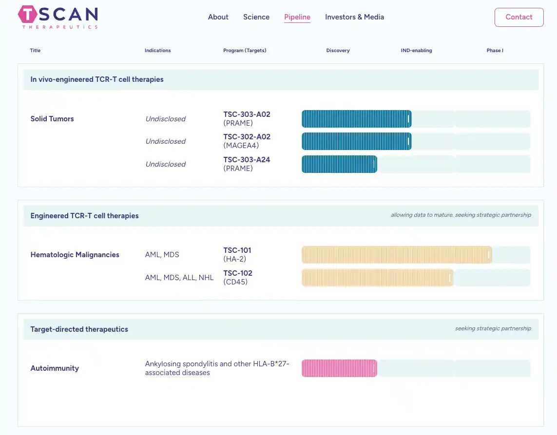
TScan a public, clinical-stage biotech company needed to communicate multiple programs and indications for the company’s next phase of growth.
The challenge was to clearly show which indications belonged to each program without confusing the user visually or crowding the pipeline’s presentation. To create this, the pipeline page uses visual hierarchy and spacing to make the pipeline easy to scan.
Different colors, separate indication boxes, and clearly labeled headlines show each program’s development stage. The pipeline presentation stays uncomplicated and clean by, again, leaving deeper scientific information outside the main pipeline and on the scientific page.
The pipeline was also developed with a structure that can easily evolve as programs and indications change.
The pipeline is clear, concise, well-developed, and organized, and the strategic use of color combinations gives it an impressive visual appeal that ties into the new Tscan website.
VIEW THE LIVE TSCAN PIPELINE PAGE
Use Interactive Pipelines When They Add Value
Interaction can improve clarity when a pipeline needs more information, or even add a hint of excitement by moving pipeline progress bars.
When using interactivity, keep the main pipeline view simple. Use interactivity when users want to explore more information, such as drop-downs, pop-ups, or toggles.
Use interaction to reveal more program information, such as MOA, clinical trial information, development milestones, and supporting research. If programs require more information, program name headers could also link to dedicated pages.
Avoid interactions like “hovers,” where information appears only when you scroll over an image or text. Also, when it comes to interactivity, consider accessibility, and don’t forget mobile devices and how it would work on them.
In the end, don’t add animation just because it looks “modern or cool.” Use interaction only to make information easier to access. Pipelines need to be clean, simple, and easy for investors and audiences to navigate.
Case Study #2: Interactive Pipeline for Public Biotech
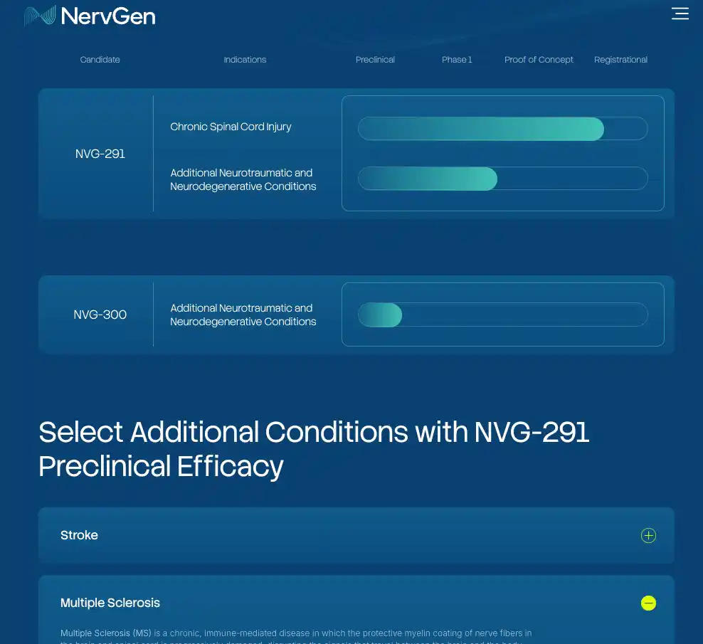
NervGen, a public biotech company, had multiple programs/indications that needed to be created and communicated clearly.
Our team simplified the pipeline page by prioritizing the lead program, indication, and development stage. Highlighting the lead program while keeping other indications easily accessible strengthens the program’s potential.
The development story is now easier to understand without removing access to deeper information, using interactive toggles and appropriate spacing.
Supporting scientific information stays outside of the main pipeline, easily accessible on the science page. This creates a clearly structured, easy-to-read, multi-indication pipeline.
SEE NERVGENS LIVE PIPELINE PAGE
Make Your Biotech Pipeline Easy to Update
Early-stage biotech companies are, well, early. Programs advance, pause, or change; clinical trials can begin; new indications could be added; programs can be paused or discontinued; partnerships can change; and company priorities can also evolve. This is why it is important to create a pipeline that is easy to manipulate, change or manage.
Some questions to think about while a pipeline page is being developed:
- Can the company easily change a program’s stage?
- Can an indication be added?
- Can you add a new program without breaking the design?
- Can programs be reordered easily?
- Can basic updates happen through the CMS, or do they need code?
- Does every change require a designer to recreate a graphic?
- What happens to the mobile layout when the pipeline grows?
Using Static Graphics vs. a Website-Native Pipeline.
A biotech company’s first website might be very simple. The pipeline might be one simple indication and program. This could be the right solution to avoid costs and keep the pipeline simple until it becomes a bit more complicated.
But for a growing company, building a pipeline as flexible website content will make updating it in the future easier, ensure the use of responsive/mobile design, improve accessibility, and make linking out easier.
Our best advice is to design the pipeline for who the company is today, but build it with future possibilities in mind.
Case Study #3: Combining the Science Platform and Pipeline
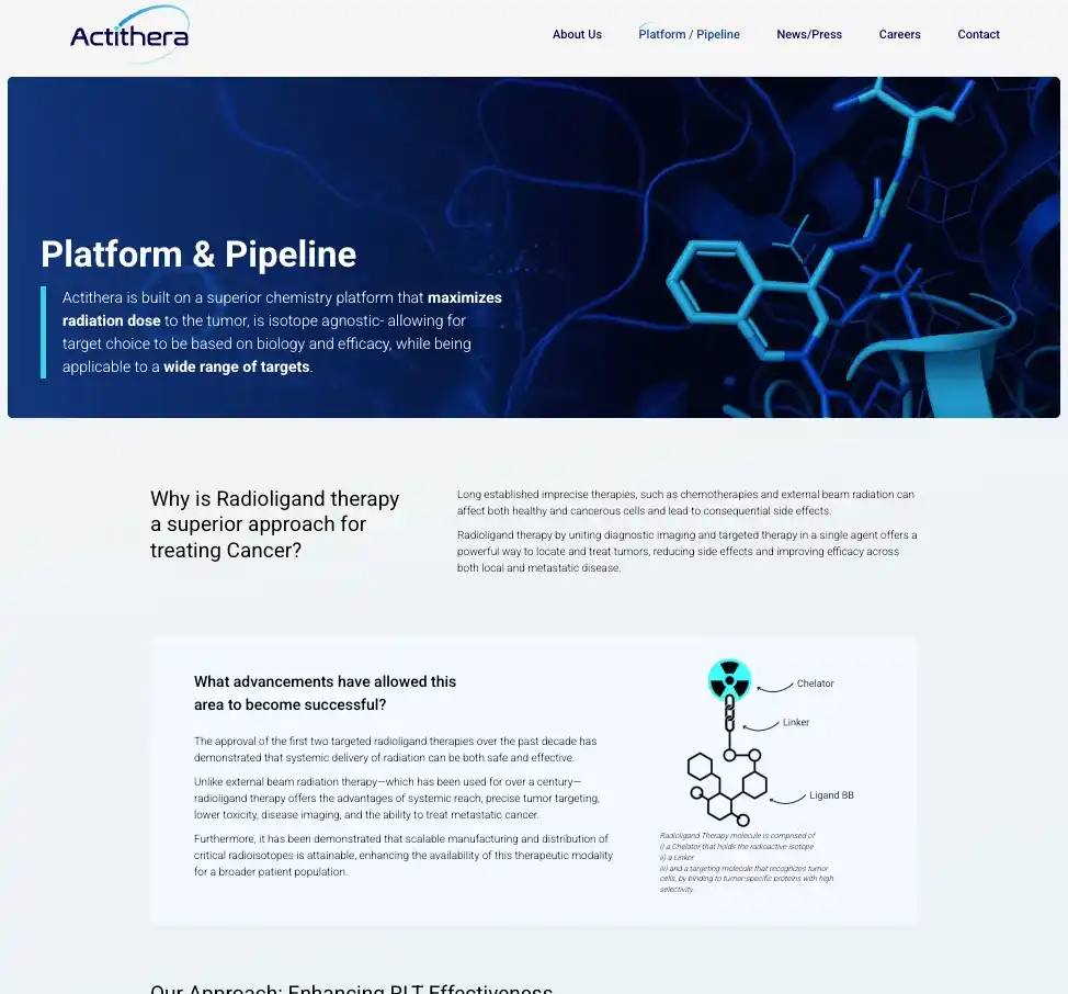
Actithera, A Cambridge-based biotech coming out of stealth, needed to explain how its platform leads directly to its pipeline programs.
To accomplish this, we combined the science platform and pipeline on one page so visitors can understand the connection. We used the page flow (scrolling down) to move from how the technology works to what it is being used to develop.
We also kept the pipeline tied to the broader scientific story, rather than treating it as a separate section. The goal of this section is for investors and scientific audiences to understand both the platform potential and current development programs.
SEE ACTITHERA’S LIVE PIPELINE PAGE
Don’t Sacrifice Scientific Accuracy for Design
The pipeline’s visual design can change how people interpret development progress. For example, extending a bar too far could imply greater progress. Stage labels that accurately represent the program may not work on mobile devices. An anticipated milestone may appear to be completed. Different indications for the same asset may be at different stages, but the pipeline doesn’t represent that well because it doesn’t fit the design.
In all of these cases, the pipeline’s appearance could create inaccuracies that affect investor interest or even legalities.
It’s important that designers don’t make changes to how scientific data is presented because something “looks better.”
The goal of the pipeline is to simplify the presentation, not the science behind it.
Review process:
Depending on the organization, the pipeline page may need to be reviewed for accuracy and compliance reasons by the following people:
- Scientific/clinical leadership
- Corporate communications
- Investor relations
- Legal/compliance
Unfortunately, the review process can add extra time to the project, but it is crucial to keep it accurate for investors and partners. Legal and compliance can take longer and are required for public-company website design.
5. Design Your Biotech Pipeline for Mobile
When designing a biotech website, the pipeline is always the most challenging part on mobile. Pipelines tend to be wide, with anywhere from 4 to 8 headings. Designs don’t always translate well to mobile. Shrinking the entire page on mobile changes the pipeline results and creates unreadable content. Horizontal scrolling makes the programs difficult to follow.
Some solutions for creating successful mobile pipeline designs could include:
- Stacking information.
- Creating a different mobile presentation.
- Collapsing secondary details.
- Using mobile-only expandable information.
- Reducing unnecessary columns.
- Keeping text labels readable.
- Make interactive elements easy to tap.
In the end, simply shrinking or keeping the current design for mobile will drastically degrade the pipeline page and create inaccuracies.
Connect the Pipeline to the Rest of the Scientific Story
The pipeline should be an entry point to your website and not a dead end.
Once a user identifies a program they’re interested in, where should they go?
Some potential path ideas include:
Pipeline → Program Page
Pipeline → Mechanism of Action
Pipeline → Clinical Trial
Pipeline → Publications
Pipeline → Scientific Platform
Pipeline → Related News
To encourage users to dig deeper into pipeline information, such as science or research, improve the user experience.
Link programs to deeper information when it exists.
Create easy interlinking that doesn’t force people to return to the main navigation or to hunt for information. Finding that scientific information should be easy.
The pipeline page provides the overview, while the other pages provide the scientific depth and evidence. Think about how you want the pipeline to fit into your company’s overall scientific story.
Case Study #4: Connecting the Pipeline to the Scientific Story
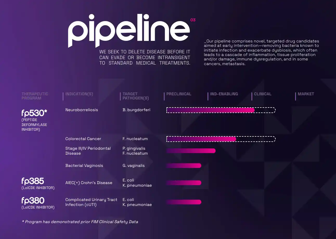
FlightPath Biosciences has a microbiome platform with a growing pipeline across multiple disease areas. The company needed to connect the platform, pipeline, and indications so investors could understand the larger opportunity.
To accomplish this, we structured the pipeline as part of the overall scientific story, and not just a stand-alone presentation or graphic. We connected programs to disease areas and platform information so users can explore deeper. Last, we created a scalable structure that can grow with the company and its changing needs for the pipeline page.
SEE FLIGHTPATH’S LIVE PIPELINE PAGE
The Perfect Biotech Pipeline Page
A biotech pipeline doesn’t need to communicate everything at once. It needs to help the right audiences quickly understand what the company is developing and where the programs stand.
A successful biotech pipeline needs to balance simplicity with scientific accuracy while still flowing with the website design. Your pipeline needs to create the same accurate experience on mobile devices. You need your pipeline to evolve with the company, so build it that way, so it is part of the website content and easy to update. Finally, give visitors a clear path to deeper information, making it easier for them to learn more.